
The Quiet Art of Modern Tudor Interior Design
Drive through Bronxville, Scarsdale, or Larchmont on almost any street and you'll find them: steep slate roofs, deep-set doorways, the occasional half-timbered gable catching the afternoon light. These are the Tudor Revival homes that gave lower Westchester much of its character in the 1920s and '30s, built by architects who wanted permanence, not trend. Inside, the same instinct shows up as dark wood beams overhead, leaded windows with small diamond panes, a stone or brick fireplace anchoring the main room. These houses were built to hold in warmth against a colder, slower kind of winter than the one most of us live now.
That inheritance is exactly why so many new owners feel torn the moment they close on one. The house is beautiful, and also dim. Solid, and also closed off in ways a modern family doesn't live. The most common instinct, understandably, is to fight it: strip the paneling, brighten every wall to white, open the floor plan until the house barely remembers what it was. Modern Tudor interior design, done that way, isn't modernizing at all. It's erasing.
What a Tudor home actually gives you
Before touching anything, it's worth sitting with what these houses offer that a newer build simply can't. The proportions were considered, not value-engineered. A fireplace wasn't an afterthought; it was the room's center of gravity. Leaded windows weren't decoration; they were how light was meant to enter, in small, considered pieces rather than a single wide sheet of glass. Even the awkward, compartmentalized layout, a parlor here, a den there, reflects a different and not unreasonable idea about how a household actually moves through a day.
None of that is a flaw to be corrected. It's the raw material.
Where modernizing goes wrong
The trouble starts when a renovation treats a Tudor home the way it might treat a builder-grade colonial or a mid-century ranch, as a blank shell waiting for someone else's taste to arrive. Knock down every interior wall, and the rooms that once felt intimate now feel like they're apologizing for their own scale. Paint over dark wood beams entirely, and the house loses the very texture that made it worth buying. The character isn't incidental to these homes. It's the whole argument for choosing one.
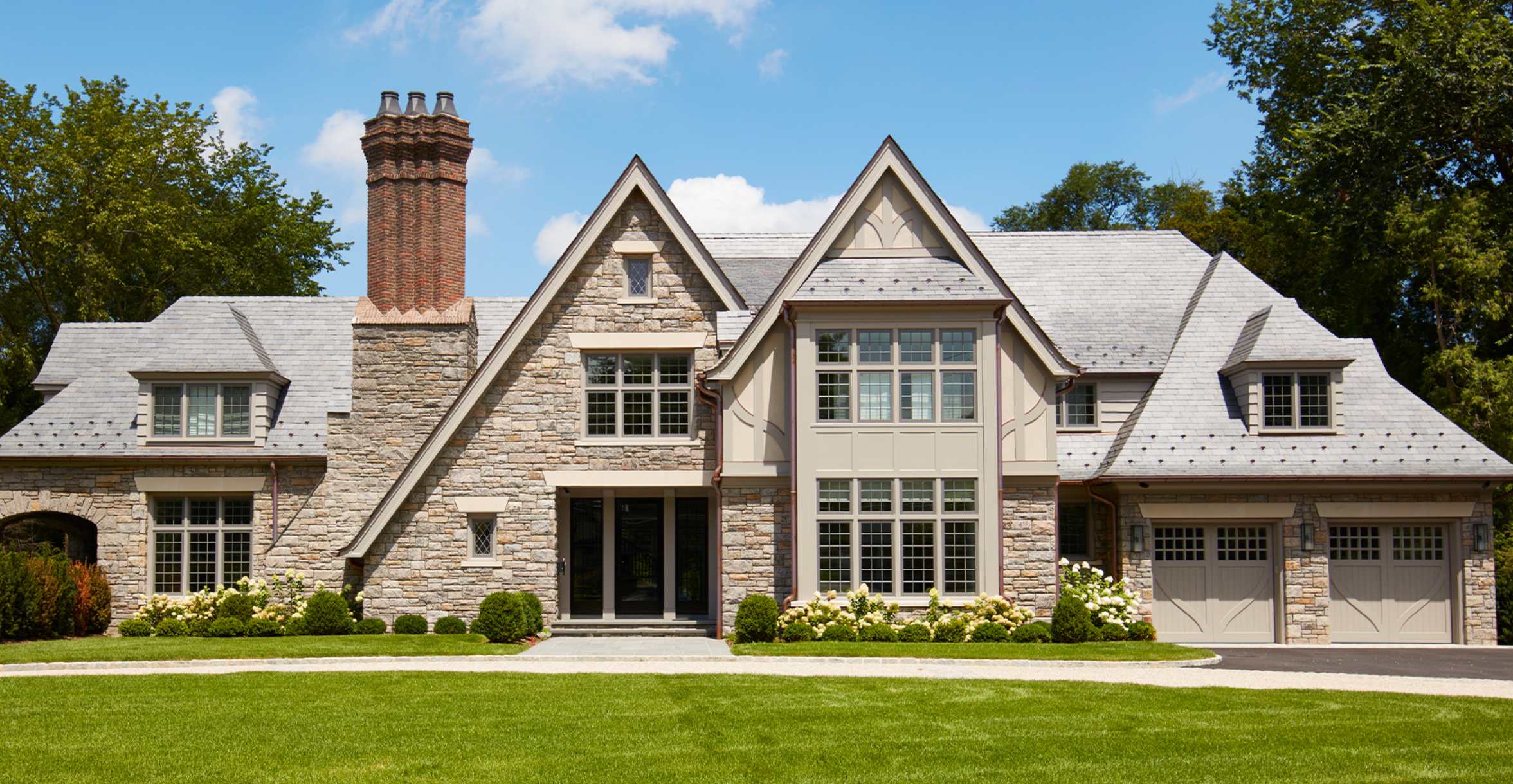
Renovated Tudor in Fox Meadow; by Cum Laude Group
The quiet edits that actually work
The better approach, and the one with a genuinely European sensibility behind it, is editing rather than erasing. Limewash over dark paneling keeps the texture of the wall while letting it breathe. Ceiling beams that have gone nearly black with age can be sanded and lightly bleached rather than painted flat, so the wood still reads as wood. Where an old archway has grown heavy with ornate trim, a softer plaster edge can carry the same shape with none of the fuss. This is the same instinct that governs a well-considered Venetian interior: respect what's already beautiful, and bring a light hand to the rest.
Furniture plays the same role. A single sculptural, low-profile piece against all that dark timber does more than a room full of matching new furnishings ever could. The contrast is the point, old bones, a few honest modern gestures, nothing competing for attention.
This is the same thinking behind the Westchester cottage Sara Mosele Interiors reimagined in a leafy neighborhood not far from these Tudor streets, a 1929 home with its own old-world gravity. There, the original layout and detailing stayed exactly as they were. What changed was everything a room needed to feel warmer, lighter, and more like the family living in it now, brought in through furnishings and finishes rather than demolition.
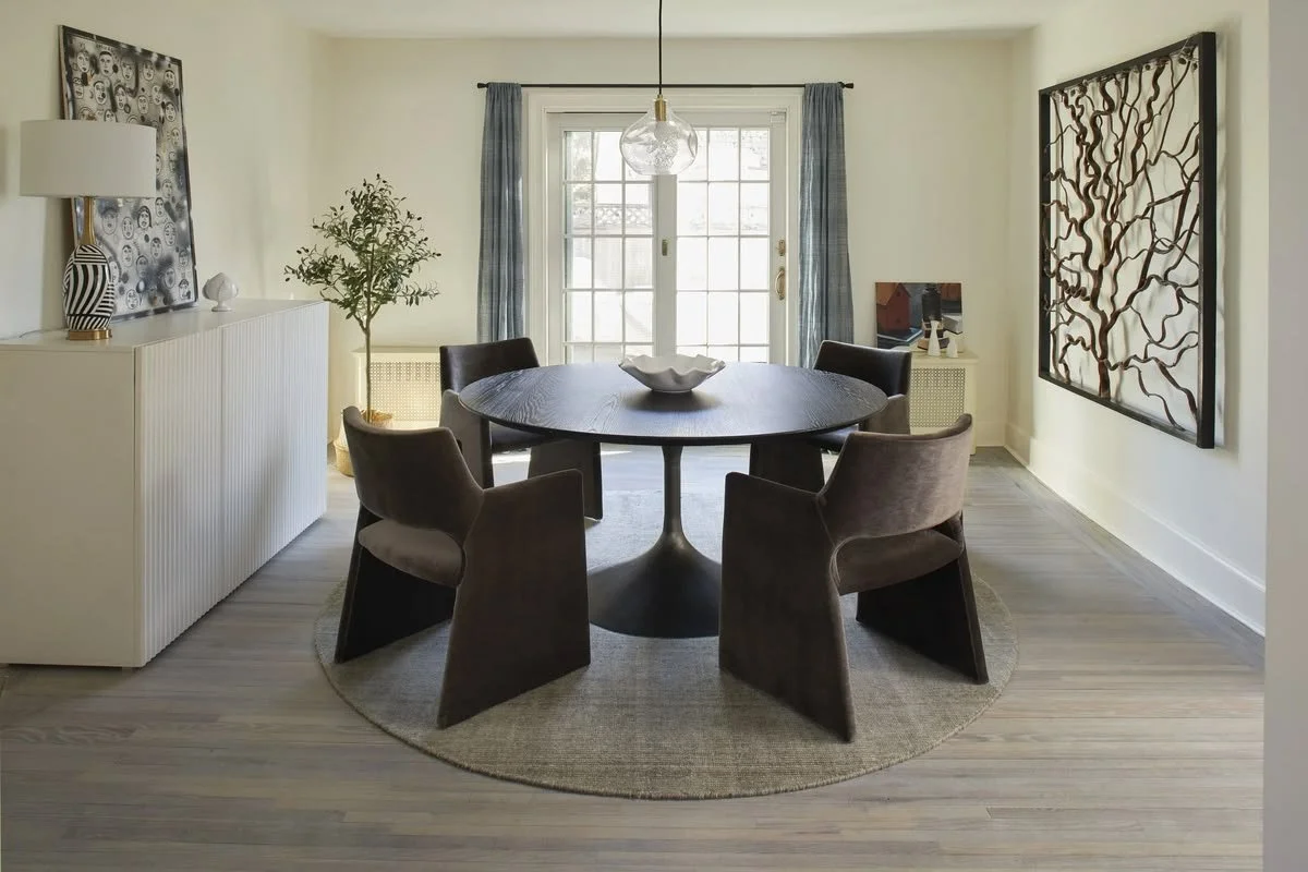
A Westchester Cottage by Sara Mosele Interiors, where original character was kept intact and warmth was added through furnishings rather than renovation
Letting light and layout do the work
Tudor homes weren't built for sunlight, they were built for shelter. That doesn't mean you're stuck with a dim house, only that the fix isn't a sledgehammer. Reworking the flow, widening a doorway here, removing one awkward partition there, can do more for how a house feels than any amount of new square footage. The goal isn't an open floor plan in the contemporary sense. It's connection between rooms that still know how to close a door when a house needs to feel quiet again.
Where an original arch already frames a passage well, keep its shape and simply update what surrounds it. The bones were usually right the first time. It's the finish around them that needs the update.
A house that still feels like itself
The families choosing these homes right now, often moving up from the city with children in tow, aren't looking for a blank canvas. They're looking for the exact thing that made them fall for the house on the first walkthrough: the beam overhead, the window seat under diamond-paned glass, the fireplace that anchors the whole room. Modern Tudor interior design, at its best, protects that feeling while quietly solving everything that made the house hard to live in day to day.
A Tudor home renovated well shouldn't announce itself as renovated at all. It should simply feel like the house that pulled you out of the city in the first place, only easier to live in now.