How to Choose the Perfect Color Palette for Your NYC Home
Choosing colors for interior design goes far beyond paint chips. In NYC—where apartments vary wildly from sunlit lofts to cozy brownstones—the palette you pick directly shapes how the space feels.
It can open up a small room, create a sense of calm, or energize a dull corner. The right colors don’t just sit on the wall—they influence your everyday experience. Here’s how to choose a color scheme that works for both your taste & your environment.
Understand the Mood You Want to Create
Every color carries emotional weight—often without us realizing. Warm tones like terracotta, ochre, & coral can make a space feel inviting, especially during NYC’s long winters. Cooler shades like sage, icy blue, or charcoal tend to calm the senses, making them ideal for bedrooms or home offices.
Before picking colors, decide how you want to feel in each space. Want your living room to feel social & vibrant? Lean into warm tones. Need focus in your work area? Cool, muted shades might serve you better.
Start With a Foundation Color
Every palette needs an anchor. Start by selecting a neutral or foundational tone—something versatile that won't overpower. This might come from a favorite piece of furniture, a beloved painting, or even your flooring. Lighter neutrals—like soft ivory or warm beige—work well in NYC spaces where natural light might be scarce. A strong base color helps other tones fall into place more naturally & supports a balanced look throughout your apartment.
Build Around Existing Furniture & Decor
You don’t have to toss everything to achieve a new look. Most people overlook how much color already exists in their space. Use what’s already working. Pull shades from existing items like:
Textiles (rugs, curtains, throw pillows)
Artwork or wall hangings
Wood tones & finishes
Upholstery or statement furniture pieces
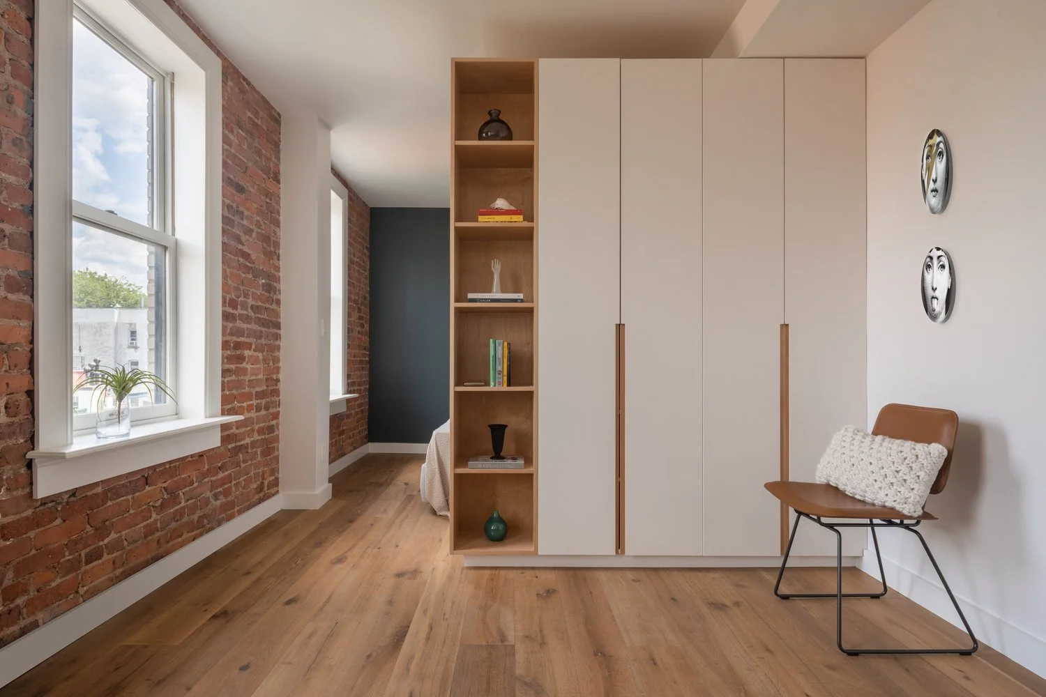
For example, Brooklyn interior designers often draw from exposed brick or original moldings—integrating natural elements into color stories that feel rooted & timeless.

Use Mood Boards to Visualize
Mood boards give your ideas structure. They help bring clarity when you're juggling multiple concepts or influences. Start with swatches, tear-outs, fabric scraps, or digital tools like Canva or Milanote. Organize them based on rooms or feelings—serene, bold, warm, minimal. This approach helps you recognize how colors interact & which combinations excite you. Seeing textures & tones side by side is a powerful way to finalize your palette.
Consider Natural & Artificial Light
Light impacts color dramatically. A creamy off-white might appear buttery in the morning but look yellow under warm artificial light. Northern exposure tends to cast cooler tones, while southern light enhances warmth. Use this to your advantage. For example, a dark hallway with no natural light could benefit from warm whites or pale greens. Always test paint swatches at different times of the day on multiple walls to avoid surprises after painting.
Limit Your Palette (But Don’t Be Afraid of Color)
Consistency creates harmony. Stick with 3–5 main colors throughout your space to keep transitions smooth. But cohesion doesn’t mean everything has to match perfectly. Add variation with texture, sheen & depth. If your main colors are white, navy & tan—introduce depth through velvet upholstery or matte wall finishes. Even a bold accent wall can fit into a tight palette when repeated in artwork or accessories elsewhere.
To see how a streamlined palette can elevate elegance in smaller homes, explore examples from luxury residential interiors.

Test First. Always.
Before committing, test your colors. Paint large swatches on poster boards or directly onto your walls. View them at different times of day—in sunlight, shade, & under artificial light. What looks cool gray on a website may go lavender in person. NYC lighting can be especially tricky in buildings with limited natural light or reflective surfaces. Taking the time to test thoroughly avoids repainting later (or worse, regretting a big decision).
Link to Your Location
Draw inspiration from the city around you. NYC’s character is packed with texture & tone. Use the rust tones of industrial brick buildings, the silvery shadows of high-rises at dusk, or even the deep green of Central Park as a jumping-off point.
Brownstones = rich earth tones
Midtown towers = sleek grays, metallics
Park views = botanical greens, sky blues
Color choices that reflect your neighborhood—whether it's Upper East Side sophistication or downtown industrial—create resonance between your interior & your daily environment.
Work With a Designer for Nuance
Sometimes, you need a second opinion. A designer can offer expertise on balance, color psychology & finish selection. They’ll help you stretch your ideas further—layering undertones, choosing accent colors & planning transitions room by room. It’s especially useful in NYC, where layouts can be quirky & every square foot counts.
If you're considering this route, an interior design consultation in NYC can provide the clarity needed to move forward with confidence.
For projects involving architectural updates, working with experienced interior architecture firms in NYC ensures cohesion between space planning & aesthetic.

Conclusion
Choosing colors for interior design isn’t just about picking pretty shades. It’s about shaping how you want to live. In a city like NYC—where every room serves multiple purposes & light shifts from block to block—a thoughtful palette sets the tone for everything else.
Start with what matters—your mood, your space, your style. Layer slowly, test often, & create a home that feels like it was always meant to be yours. If you’re located outside Manhattan, our perspective as an interior designer in Westchester County brings city-level sophistication to surrounding areas as well. For luxury-driven projects, learn more about our approach to interior architecture in NYC and how thoughtful color choices shape timeless spaces.
Why Sara Mosele Design?
Ready to transform your NYC home into a space that truly reflects your lifestyle?
At Sara Mosele Interiors, we specialize in reimagining spaces with a blend of European elegance and New York practicality. Explore our Interior Architecture Services to see how we can bring your vision to life.
Welcome!

Hi, I’m Sara. I design spaces that speak to the soul - elevated, timeless, and deeply personal. With roots in Italian elegance and a home in New York sophistication, my work blends refined aesthetics with livable luxury. Whether it’s a city condo or a Westchester retreat, I believe every detail should serve a purpose and spark emotion.
Let's Connect
Have a question about design? Want to collaborate on a project? Or just curious about the stories behind our spaces? I’d love to hear from you.